Holland America Line
Pre-Embark Experience
CHALLENGE
I led a complete redesign of the Pre-Embark Experience – the e-commerce site that allows customers to plan and customize their cruise experience prior to boarding by purchasing shore excursions, dinner and spa reservations, wine packages, and other experiences to enjoy during the cruise.
MY ROLE
Lead Interaction Designer
Visual Designer
PROCESS

Challenges
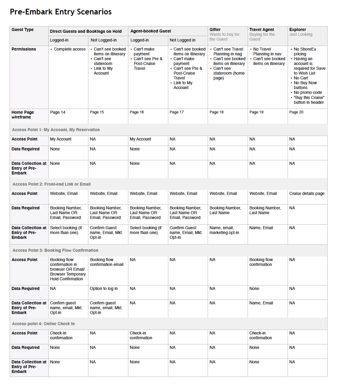
- Variations in user flows based on who was making the purchase: the person cruising (who booked direct vs. through a travel agent), someone else buying them a gift, a travel agent, or someone who was just browsing and has not booked a cruise yet.
- Variety of products – I needed to come up with a design pattern that would work for a variety of product lines and pages, some with hundreds of products to choose from and others with just a handful.
User Research
I collaborated with a user researcher to conduct a usability study on a prototype of the on-board experience app, which had similar features to the ones we were considering.This also gave us the chance to talk to cruisers to learn more about their behavior around customizing the cruise and booking extras.
We received lots of great feedback on terminology and iconography, but two key findings stood out:
1. Recommendations are seen as trustworthy and helpful
Most participants liked seeing recommended shore excursions and on-board activities to help them lessen the paradox of choice.
2. A Wish List helps enable collaboration
Booking vacation activities is often a collaborative experience, so customers valued the ability to save activities they are considering for later so they can get feedback from their friends and family.
System Design
Site Architecture, Modes & User Flows
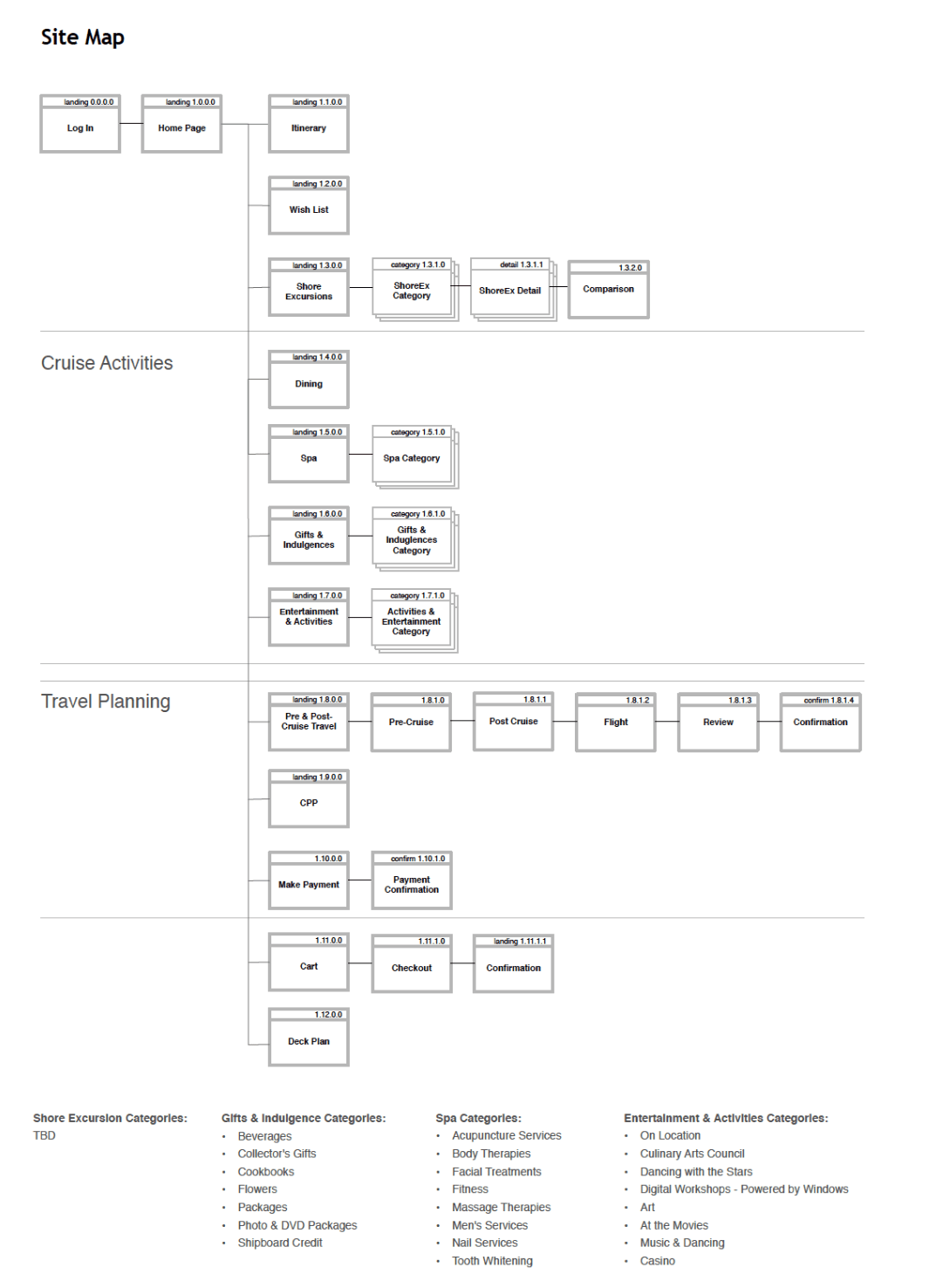
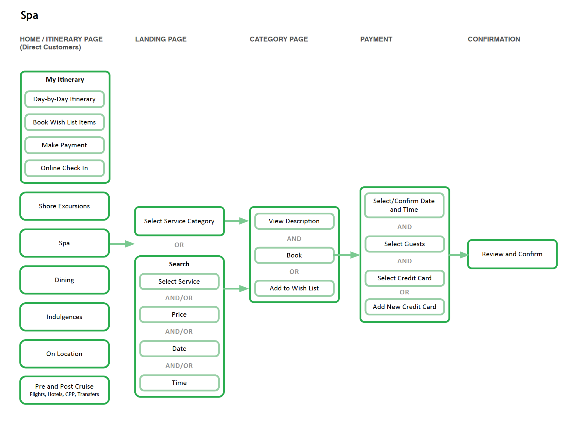
I began by creating a Site Map and User Flows to help capture all the different parts of the site that would need to be designed. The system had a lot of different components that needed to work together to create a seamless planning and purchasing experience, including:
- Cruise information: itinerary, stateroom, deck plans, ship information, wish list
- E-commerce: users could purchase shore excursions, gifts, spa reservations, etc.
- Travel planning & booking: search and book flights and other transport before and after the cruise
- On-board activities: art exhibits, computer classes, and shows that visitors could attend free of charge
In addition, the information presented to users would vary based on a variety of criteria including who they were (travelers, travel agents, gifters) and their login status on the site. This was to protect the traveler’s privacy and Holland America Line’s competitive information (such as prices for activities and excursions).
Interaction Design & Usability Testing
Wireframe Prototype
I created a wireframe-level prototype in Axure that showed off all the major flows – booking shore excursions, spa visits, viewing the itinerary, and the checkout process.
Usability Studies
I worked with a user researcher to conduct RITE testing (Rapid Iterative Testing & Evaluation) with 10 participants. We ran a study with 5 participants, made changes the next day, and tested again. By the end we had a few more tweaks to make, but overall the feedback was very positive.
Home Page
For the home page we tested three variations that placed varying levels of emphasis on recommendations, itinerary, and navigation to the various parts of the site. The first option featured a wizard that asked users a few questions to recommend products. The second placed most of the emphasis on the itinerary and incorporated recommendations. The third was more browse focused, featured a large photograph at the top and placed a few recommendations under the hero. After usability testing, we decided to go with the third option which was the easiest of the three experiences, and provided easy access to the itinerary from every page.
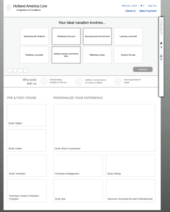
Recommendations Wizard
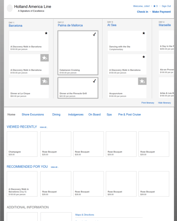
Itinerary Focused
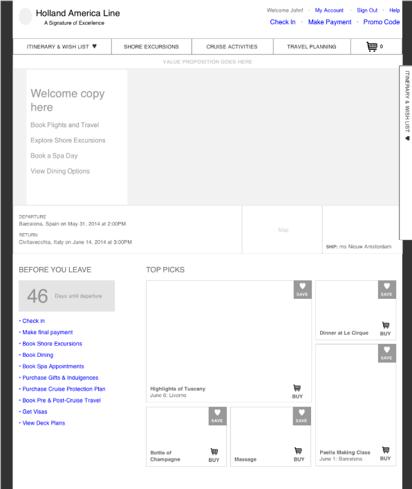
Browse Focused
Cruise Itinerary Widget
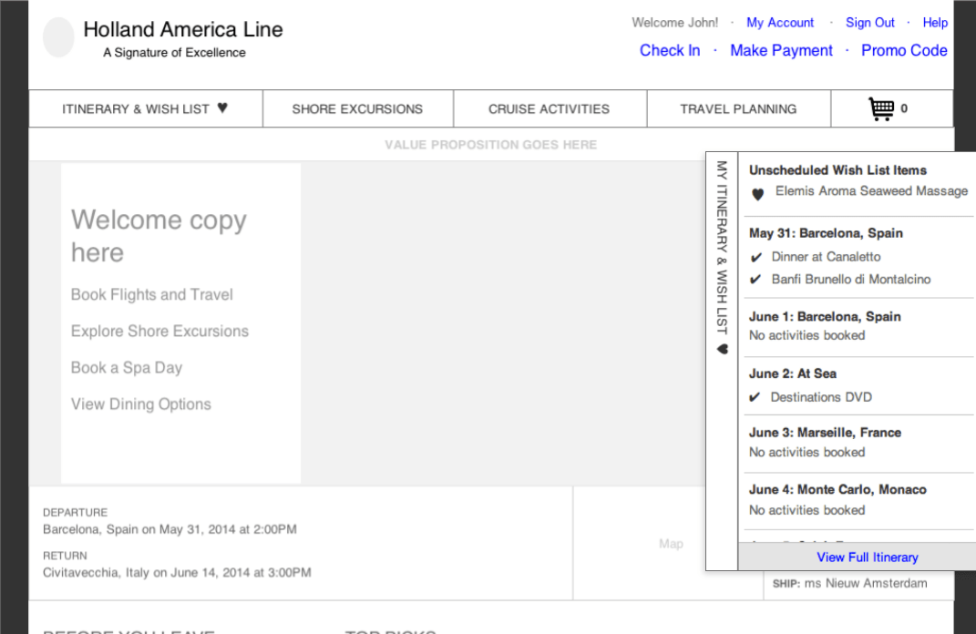
The main goal of the site was to help cruisers plan and customize their cruise. One of my favorite features was the Cruise Itinerary Widget I added to the side of each page that could be expanded to show the itinerary day by day with the activities the customer had booked, added to the cart, and added to the wish list.
E-Commerce & Cruise Activities Framework
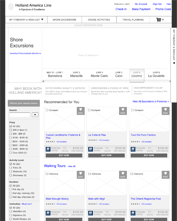
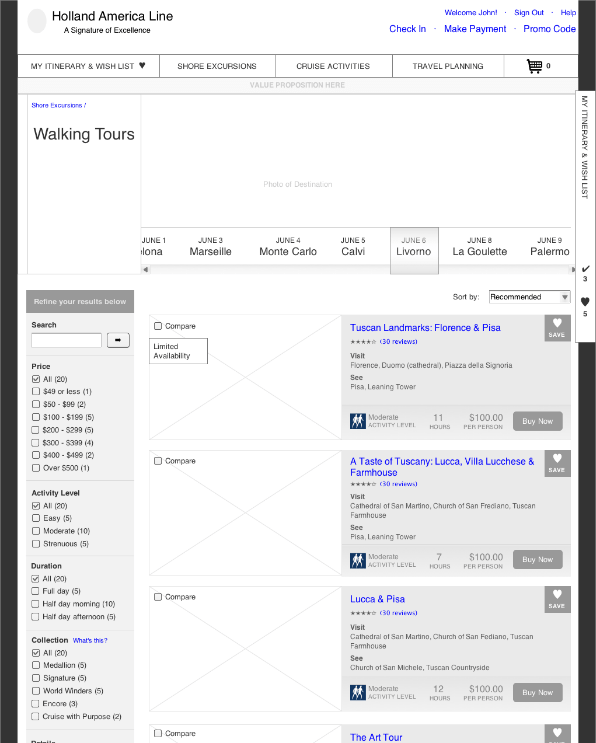
I came up with a design system to handle the various products and experiences sold and described on the website. The larger product areas (those with hundreds of offerings), such as Shore Excursions and Indulgences had a high-level Landing page that provided filters, recommendations, and allowed users to drill into a specific category (ex. Walking tours, Bus Tours). The next step was the Category page, which provided a more detailed view of all the offerings within the category. Lastly, the Detail page provided all the information a user would need to learn about and book the specific offering.
This was a flexible framework: smaller e-commerce product areas, such as Spa, only had a Category page, and very small onboard experiences, such as the Culinary Arts Center or the Dancing with the Stars at Sea program only had a Details page.
Landing Page
Category Page

Details Page
Visual Design
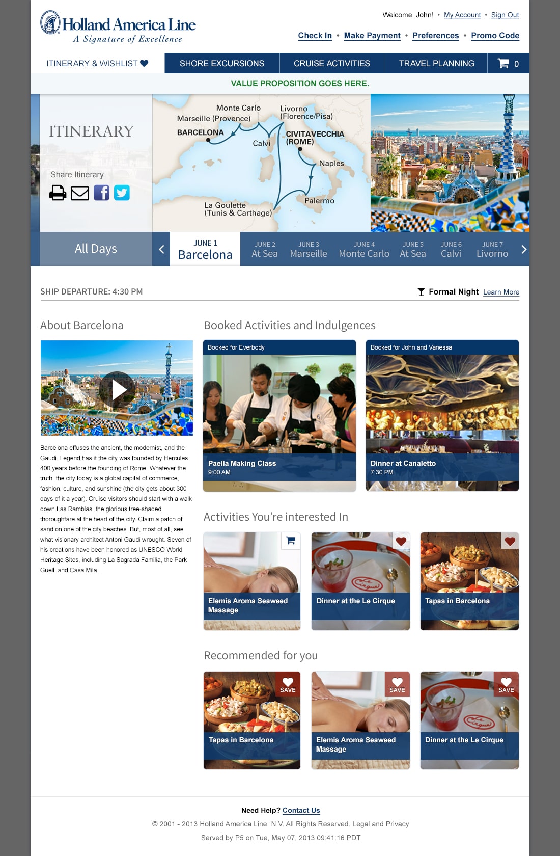
I collaborated with a visual designer on some of the key pages of the site, such as the Itinerary page. The goal of the visual design was to represent the Holland America brand and help customers imagine and get excited for their upcoming cruise. Holland America has access to hundreds of beautiful destination photographs and I wanted them to feature prominently across all the pages.
Customer Feedback
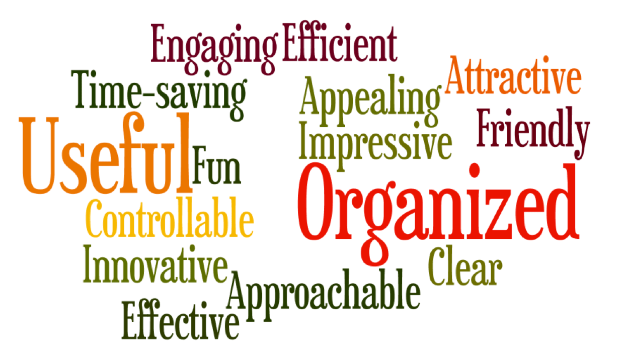
Our usability study participants enjoyed using the new design, as part of our second day of testing we had them participate in a Desirability Toolkit exercise where they chose from 100 positive and negative words to describe their experience. Their feedback was overwhelmingly positive, the word cloud below shows the most commonly chosen words.
