Holland America Line
Mobile Experience
CHALLENGE
Holland America Line hired Blink to create an adaptive version of its main website for mobile. We focused primarily on the home page and the browsing experience so customers could find, favorite and book cruises from their phones.
MY ROLE
Interaction Designer, Visual Designer
PROCESS

Business Goals & Use Cases
The goal of the mobile site was to help customers discover cruises they are interested in and convince them to book. Cruises are expensive and require a lot of planning and decision-making (everything from travel dates, to stateroom choices, to dinner times) and the decision is often collaborative – friends and family traveling together need to coordinate their schedule and decide on activities. Because of this, many customers might start the process on a phone, pull up the cruise description on the go to show it to their fellow travelers on mobile, but then transition to the desktop site for the actual booking.
Page Flow
From the home page users could decide whether to search for a cruise or browse promotions. There were two main user actions the client wanted to promote: booking and adding to favorites. Adding to favorites allowed customers to begin their search on a mobile device and continue on desktop, as well as quickly retrieve their favorite cruises to show to friends and family.
Transactional vs. Aspirational
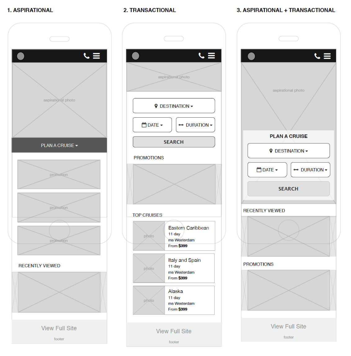
One of the key decisions points for the design was whether to go with a more transactional approach, that emphasizes the cruise search and booking functionality (typically the preferred approach for Holland America on the desktop site), versus a more aspirational approach, that emphasizes large imagery and browsing to entice users to take a cruise.
Impact on Interaction Design
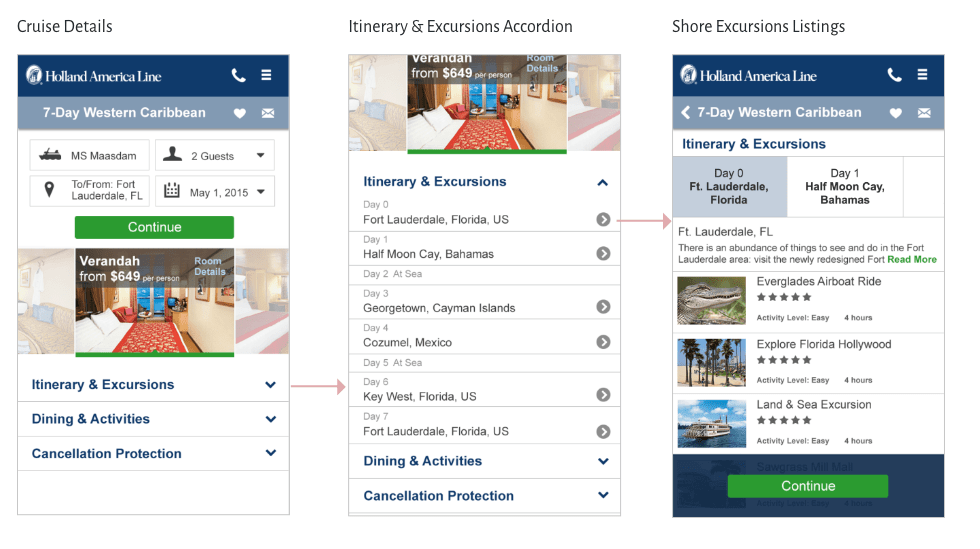
The notion of transactional vs. aspirational design is manifested in the information hierarchy and interaction model on the Home page and Cruise Details page (described below). In each design, the features I was looking to emphasize are located towards the top of the page, while the lower-priority features are condensed using accordions, sliders, and secondary pages.
Visual Design
One of the key challenges for the visual design was reaching the right level of information density. Having worked on several projects for Holland America, I knew that their customers (mostly Baby Boomers) tended to prefer medium to high information density, so I worked to combine beautiful imagery and white space with actionable and informational content.
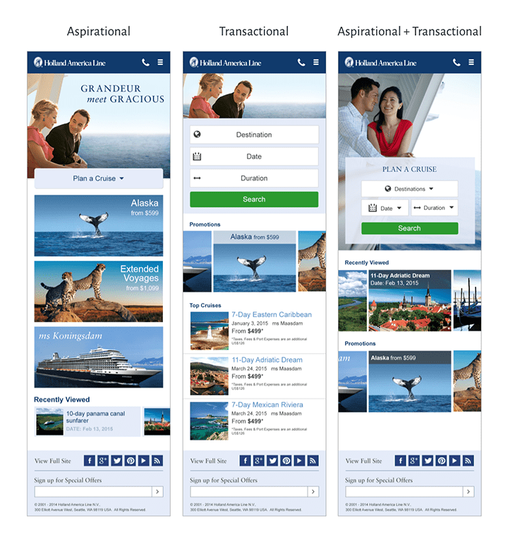
Transactional and aspirational design had a large impact on how photography is used on the site. The aspirational approach placed greater emphasis on the destinations, onboard dining, and photos of happy couples to help customers imagine being on the cruise. The transactional model, on the other hand, featured more prominently photos of the staterooms that users could book.
Home Page
I worked on three iterations of the home page. The first one was the most aspirational, it featured large photography and promotions with a collapsed Cruise search experience. The second was the more transactional one, using a lot of the screen real estate to keep the cruise search near the top. The last was a combination of the first two and featured a large image at the top with the search widget overlaid on top.
Wireframes
Visual Design
Details Page
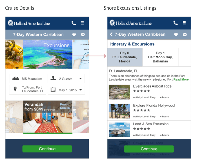
I designed two versions of the details page. The first was more transactional and placed greater focus on booking the cruise, with the booking widget right at the top of the screen. The second, on the other hand, had a slider at the top with images of the destinations, dining onboard, and the itinerary map.
Transactional
Aspirational
Quantitative Testing
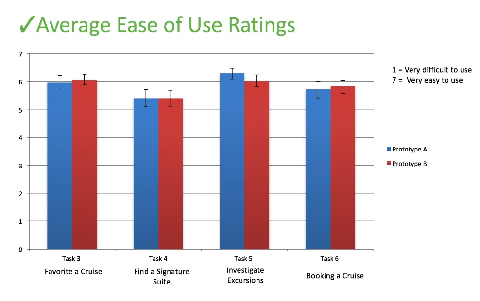
I worked with a user researcher to conduct an unmoderated, quantitative study on the three variations of the home page and two variations of the details page with existing and prospective Holland America customers.
Home Page: Aspirational + Transactional Hybrid
The third home page option, combining Aspirational and Transactional elements turned out to be the most appealing to cruisers.
Details Page: Transactional
For the details page, we found that the transactional option was slightly more successful in converting customers, so our Holland America client preferred it over the aspirational.
