Adobe Muse
In-Browser Editor
CHALLENGE
Adobe Muse was a desktop application that allowed professional designers to create completely custom websites without writing any code. In-Browser Editing (IBE) is the web app that the designer’s clients used to update their websites. When I joined the team was just beginning to undertake a complete redesign and rewrite of the application to enable inline editing and more advanced functionality.
MY ROLE
Designer, Researcher
PROCESS

Key Challenges
- Endless Edge Cases
Because Muse was a freeform design tool, there was almost no way to predict what their site was like – they could have one page or 500, a simple page with a few elements and a very long one with hundreds. - Technical Limitations
The key challenge for the In-Browser Editor (IBE) were the inherent technical limitations. Because Muse rendered the website only at publish time, IBE could only replace existing code rather than add new code. For example, a user could replace an image in a slideshow, but not add a new one at the end. - Interaction Design Tradeoffs
One of the key decision point when creating a design tool for websites is whether to prioritize browsing mode (I click on a link and it opens the destination) or editing mode (I click on the link to edit it). I was of the mindset that an editing tool should prioritize editing over browsing, but I needed to convince the rest of the team to go along with me.
User Research
Site Analysis
I looked at the top 50 most edited websites to better understand the types of businesses that used IBE and how many pages the typical site was. I wanted to understand what the 80% case was that I could design for. I then used that information to recruit participants for a round of field interviews.
Field Interviews
The goal of the interviews was to better understand what small business owners look for in a website, what it was like to work with a designer on their site, and what it was like to maintain it on their own.
I invited two engineers to come to each interview to help them gain a better understanding of our customers. At the end of the interviews, I organized a workshop with all the engineers to talk about our findings and then created two personas based on them.
Data Synthesis Workshop
After all the interviews were complete I organized a workshop with all the engineers to get them to share what they had learned in the interviews they attended. The goal was to help them internalize what they had heard and gain a broader perspective by hearing other people’s experiences.
Personas
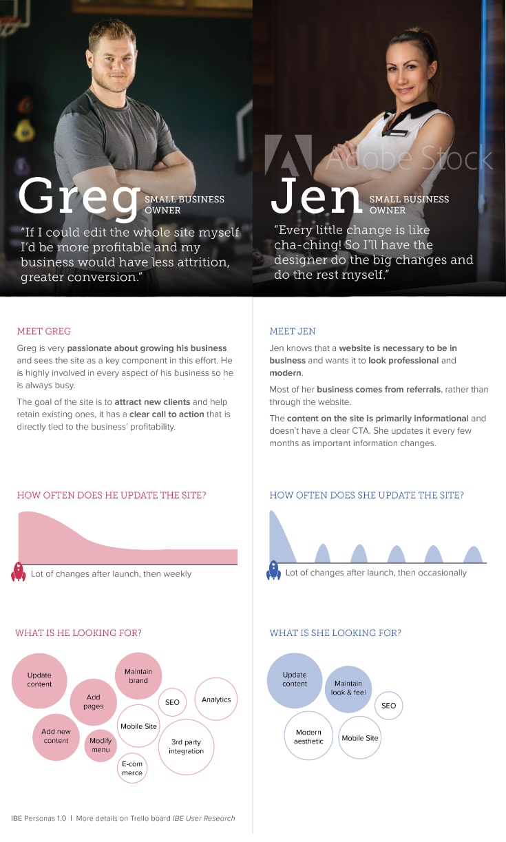
I analyzed all the data I gathered and identified two key types of personas based on the role the websites played for their business and their updating behaviors.
Design Principles
Based on my findings from the competitive analysis & user research, I defined three key principles.
Intuitive & Memorable
Most of our users will be using IBE periodically, they need to be able to pick it up quickly and effortlessly each time.
Scalable
Must work both with existing IBE features as well as more advanced capabilities we might add in the future (ex. editing widgets, adding pages and page components).
Touch Friendly
Must work with touch-enabled large format devices such as Microsoft Surfaces and iPad Pro.
Interaction Design & Usability Testing
As I translated the design principles into the interaction design, one of the key decisions was whether to prioritize clicking to edit vs. clicking to navigate (ex. open a link or an accordion). I prototyped three interaction models that solved this in different ways and ran a few rounds of remote usability testing using Usertesting.com to determine which one would be easiest and most memorable for users. The test script included simple use cases, such as replacing text, but also more complex ones that tested the boundaries of editing vs. navigating such as opening an accordion or modifying the accordion’s label.
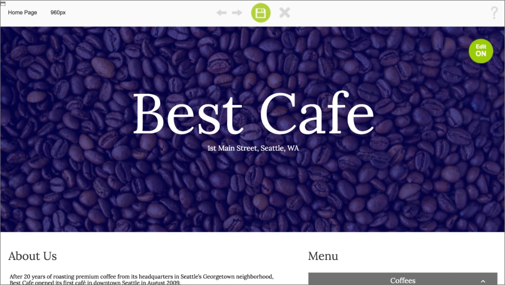
Option 1: Edit Mode Button
This prototype has a toggle to turn on and off editing. When editing is ON, clicking on any textbox will activate it so the user can edit the content but clicking on buttons will not work. When editing is OFF, clicking on a textbox doesn’t do anything, but users can click and open links, buttons, and accordion modules. By default, the prototype begins with editing turned ON. This prototype prioritizes editing over navigating.
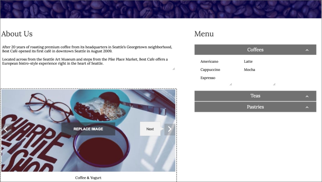
Option 2: Long Click/Tap vs. Short
This design was inspired by touch-centric mobile apps, where a long press is used to enable editing. In this prototype a short click or tap is used to navigate (ex. open an accordion tab), and a long click (1 second) enables editing. When the user presses the mouse button a progress bar in the shape of a pencil appears and once it’s entirely full the textbox enters edit mode. One of my concerns with this model was that it would not be memorable enough, so I ran a quick longitudinal study on usertesting.com where I had the same people test the prototype two weeks apart to see if they could remember how it worked – as I guessed, they did not!
Option 3: On-Object UI
In this prototype clicking on a textbox activates it for editing, and clicking on a button or accordion header displays a tooltip with a button to open it. This prototype prioritizes editing over navigating.
Based on the findings from the usability studies, this is the design I chose to move forward with into visual design.

Visual Design
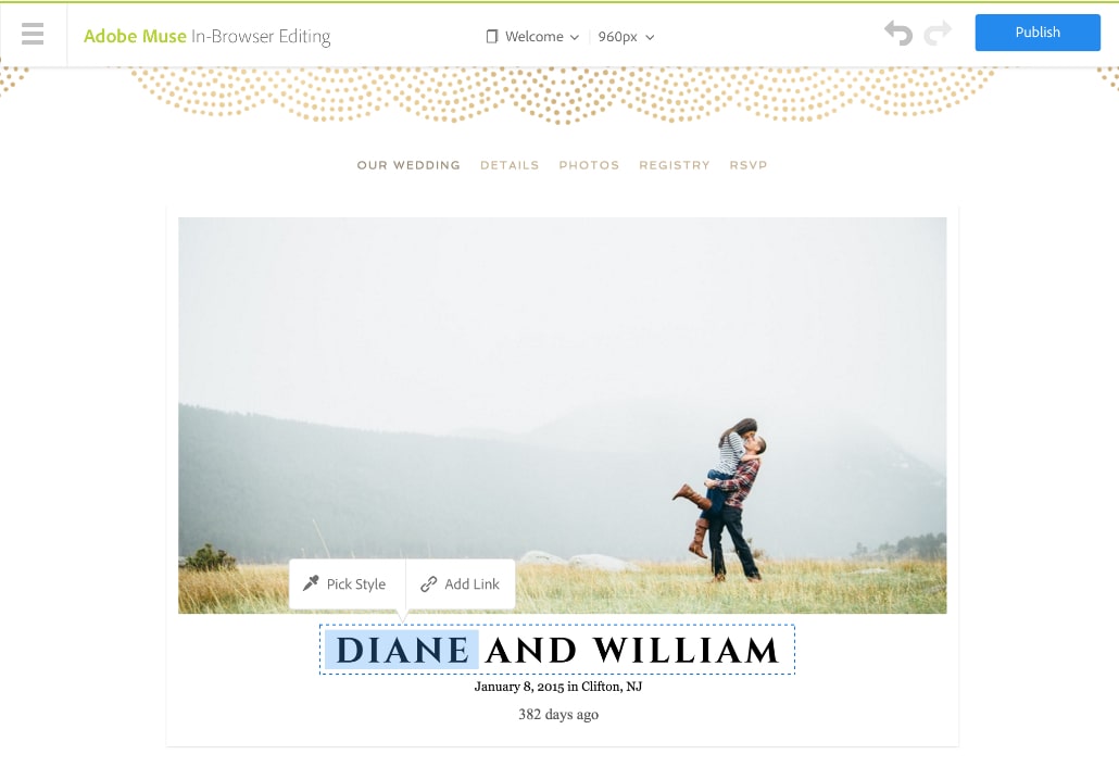
Once the interaction design model was finalized, I moved on to the visual design. My goal for the visual design was to make sure it reflected the Adobe brand, while also looking approachable for non-professional designers. I leveraged patterns from Adobe’s design language and the more modern, non-professional Adobe Spark apps to make sure it would feel consistent and on-brand with other Adobe web applications.
Launch & Next Steps
We successfuly launched the revised design and started taking advantage of the expanded capabilities to add some features customers had been asking for a long time. For example, because users could now edit the text inline we were able to add the ability to apply text styles – this would not have been possible with the previous version of the application. Our customers were thrilled!
