Adobe Spark Site
Semantic Sections
CHALLENGE
The goal of this project was to reimagine how small business owners and students could add content to their website in a way that would encourage them to create beautiful sites with a clear information architecture. A section in Spark Site was a horizontal block of content that could include a combination of text, images, videos, icons, and buttons.
MY ROLE
Designer, Product Owner, Researcher
PROCESS

What is a Section?
Sections were the building blocks of Spark Sites. They were stacked vertically to create the information architecture of the page.
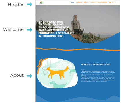
Original Design
Layout-Based
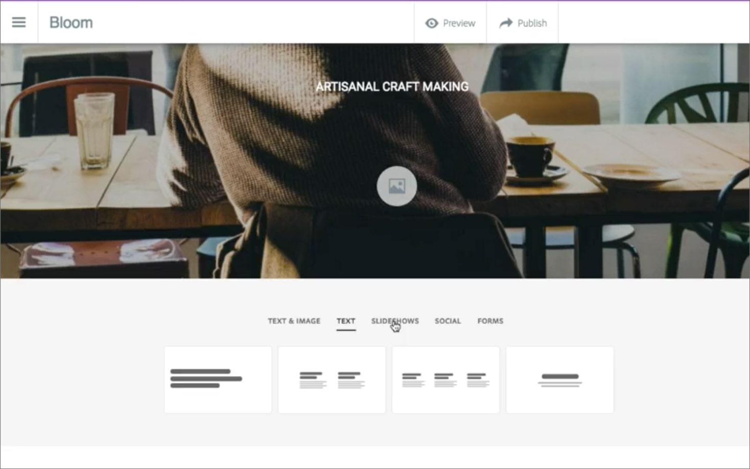
When I began working on Spark Site, users could choose from a few layout-based sections, such as Text or Text & Image. I had a hunch that small business owners with little web design knowledge would not know how to choose the best layout for their content.
Inflexible
Another issue with the original approach was that it wasn’t very flexible, if a user selected a Text-Only section, they couldn’t later add an image or a button to it. This meant that we would have had a lot of very similar sections with little variation and if they user changed their mind they would need to add a new section and copy over their content.
Data Gathering
I had a hunch that our sections would need to be semantic and flexible, but I needed to do some research to validate this and have the data to back me up and convince the engineering team to re-architect the system (not an easy task!).
Analysis of Real World Examples
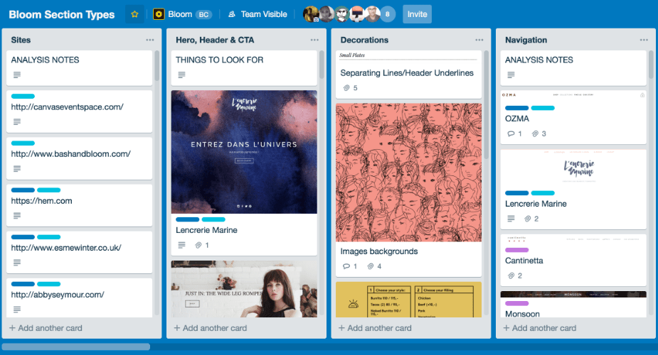
I looked at 50 websites across different industries to identify common types of sections and built a library of screenshots in Trello, these were useful to see the variations and as inspiration for our own layouts. I took a deeper look at the most important ones (ex. hero, navigation, contact forms) to identify the most common patterns.
Card Sort
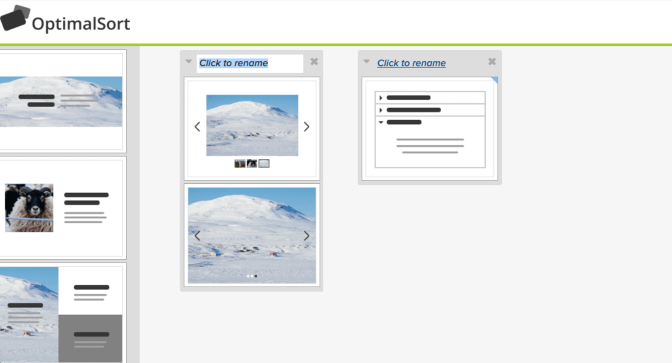
I conducted a card sort exercise asking participants to group thumbnails of sections as they saw fit. I found that most participants grouped them based on their purpose (ex. About, Location) and role on the page (ex. header), rather than on their layout.
User Research with Paper Prototypes
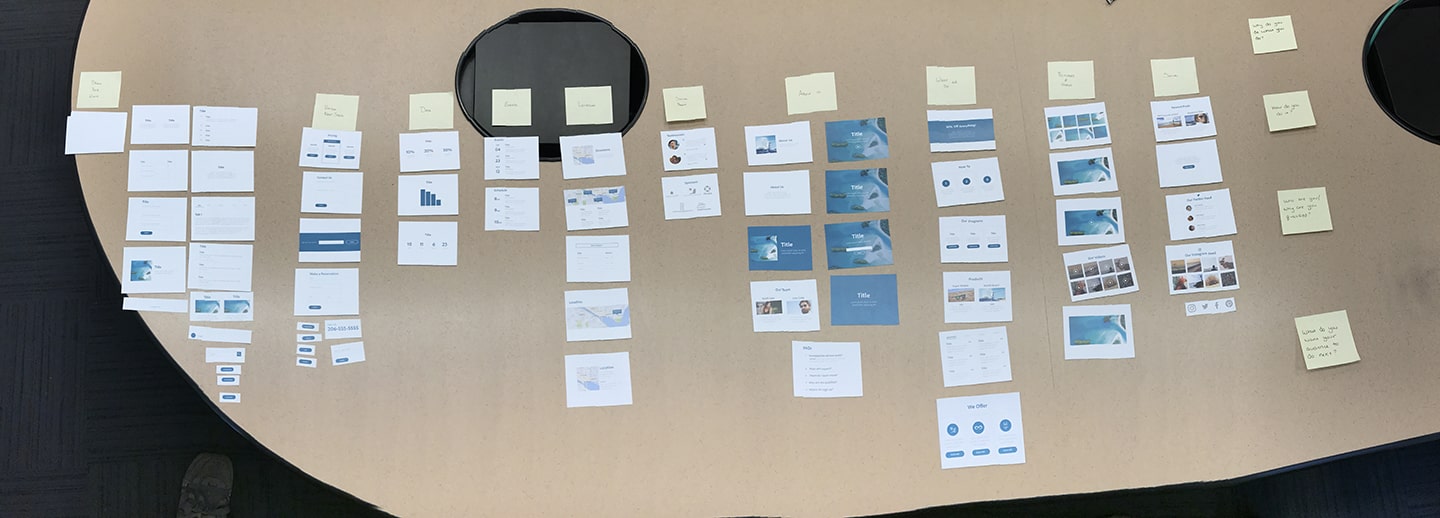
I collaborated with our PM and the other designer on the team on a series of interviews where we asked participants to create the structure of their website using a library of printed sections. They could choose from layout-based and semantic sections. Participants loved the semantic sections because they gave them ideas for content they could put on their website and they were excited about the opportunities – I called it the Candy Store effect.
Making Sections Flexible
Content-Aware Microlayouts
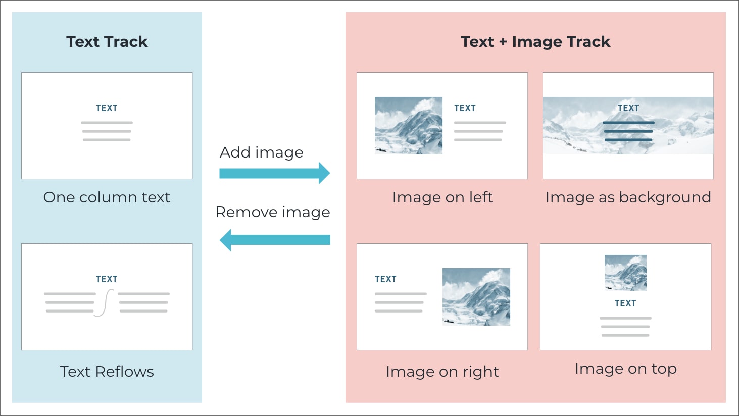
My analysis of common design patterns showed that there were a lot of very similar layouts with just a few small variations, such as text with and without an image, and with or without a button. I worked with the engineering team to help them understand why we needed the new architecture and come up with a solution together. To kick off the conversation, I came up with a track system that provided alternative layouts based on the content the user had in the section, and allowed them to add or remove content and get updated layouts. I presented this both as a diagram and as an XD prototype. This helped us move the conversation forward and convinced the engineering team to re-architect the system.
Making Semantic Sections
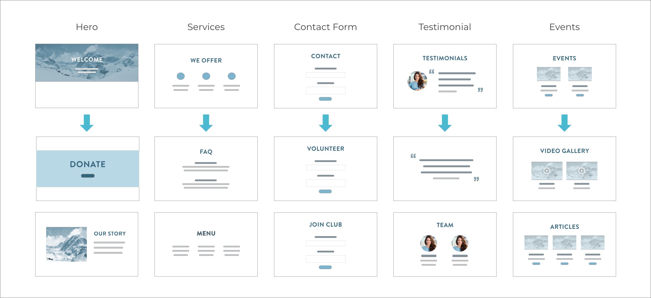
Once the team was onboard with moving to semantic sections, the next step was building a library of semantic sections for users to choose from. The Spark Site PM chose the first 5 sections based on their layout, then I looked at the types of websites we were targeting to identify new ways to reuse them. I changed the placeholder content and the starting layout so that by the end we had over 40 semantic sections for our users to choose from. This was a quick, low-effort way to test our hypothesis of having a large library of sections. I was also responsible for how they were categorized in the UI.
Maintain the Backlog
As part of my role I was also responsible for keeping a backlog of sections that I wanted to add and work with our PM and Engineering Manager to make sure they got built. This included both repurposed sections as well as brand new sections that expanded the functionality of Spark Site.

Implementation
The video below shows the final implementation. Users could drag and drop sections onto the page, add and remove elements and content from the sections and see alternative layouts based on their existing content.
Future Plan
In the future I was planning on making the following improvements:
- Vary sections shown based on use case / industry
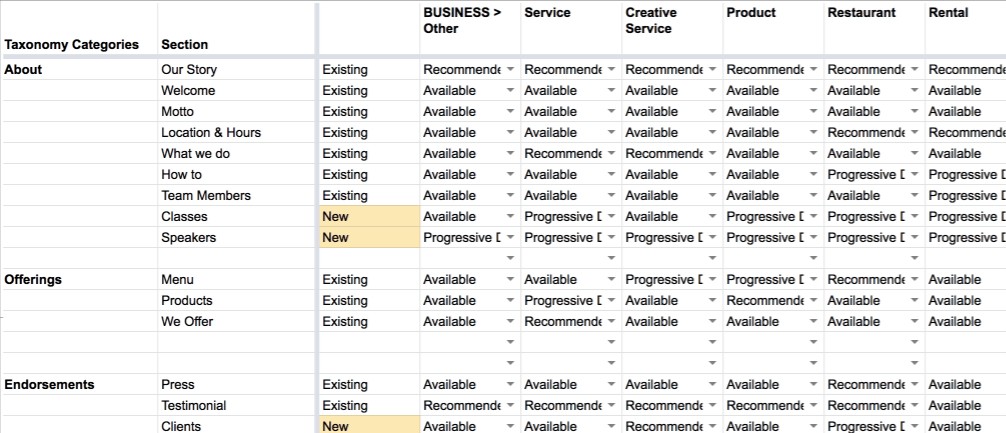
For example, the “Donate” section would be shown to owners of Non-Profit sites, but not Restaurants. Initially, this was going to be done based on my best judgement (see the spreadsheet below), but in the future I would have liked to use analytics from our actual user’s sites to inform this. - Provide recommended sections
Initially just based on their use case, but in the future also taking into account which page they are editing, and what content they already have on the site.

